
Turning concepts into clear outcome.
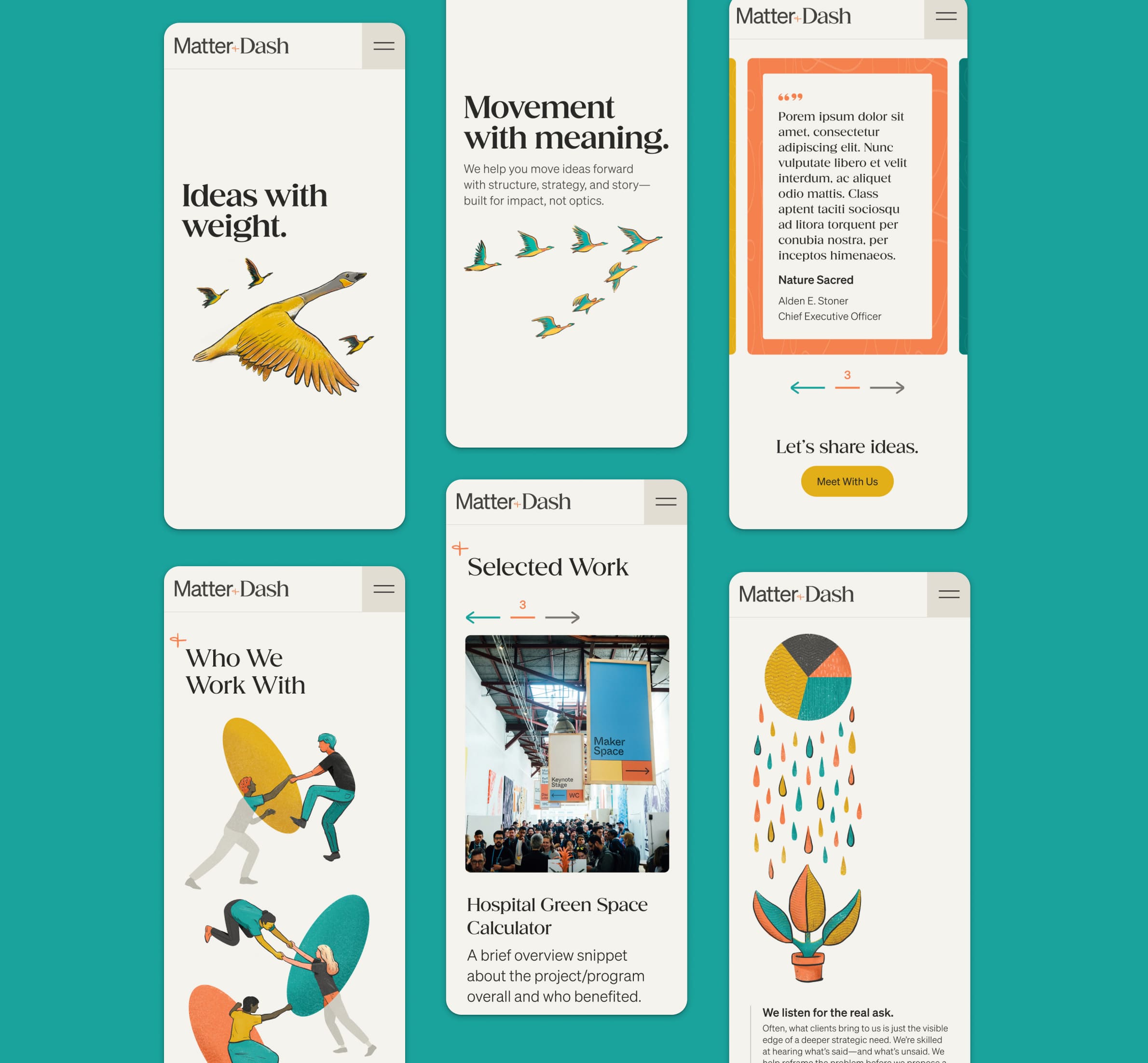
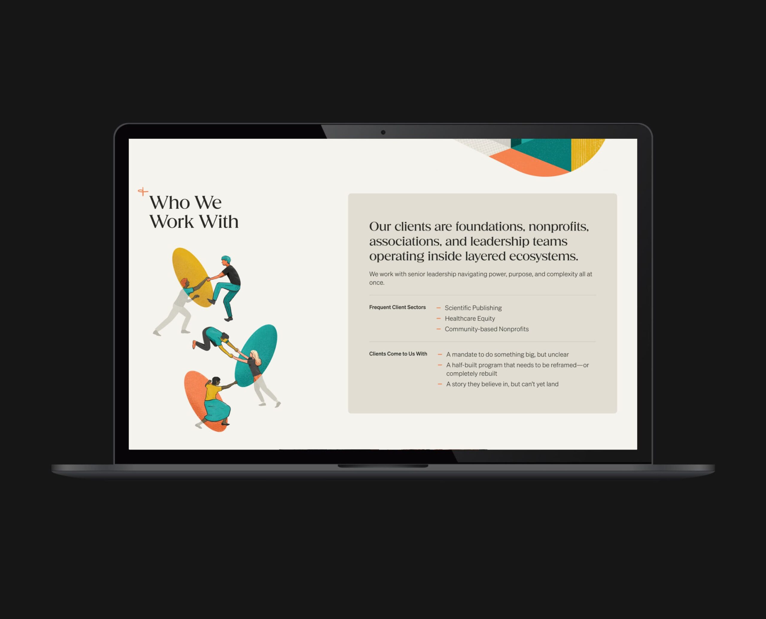
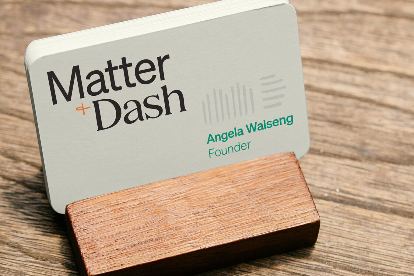
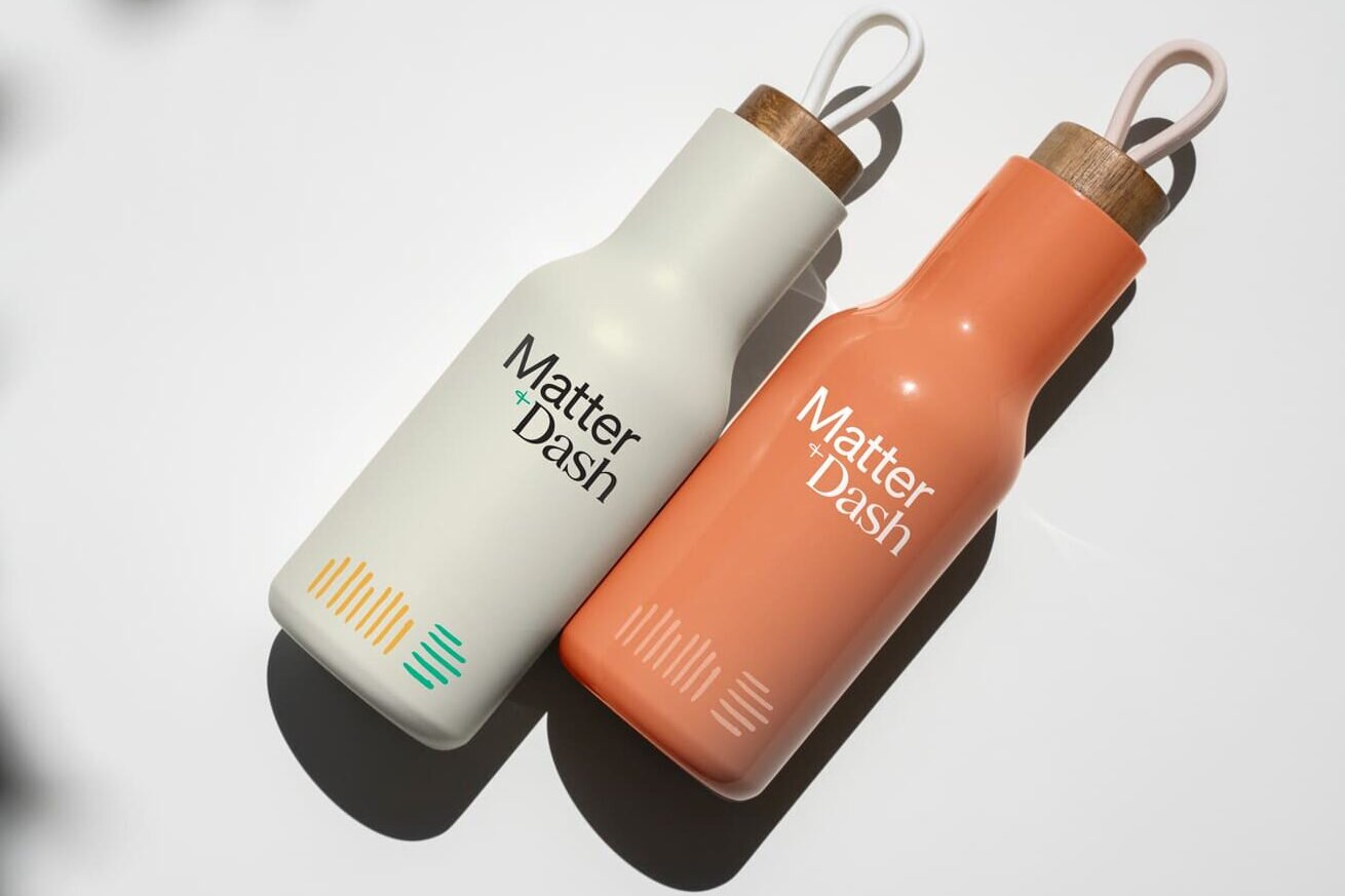
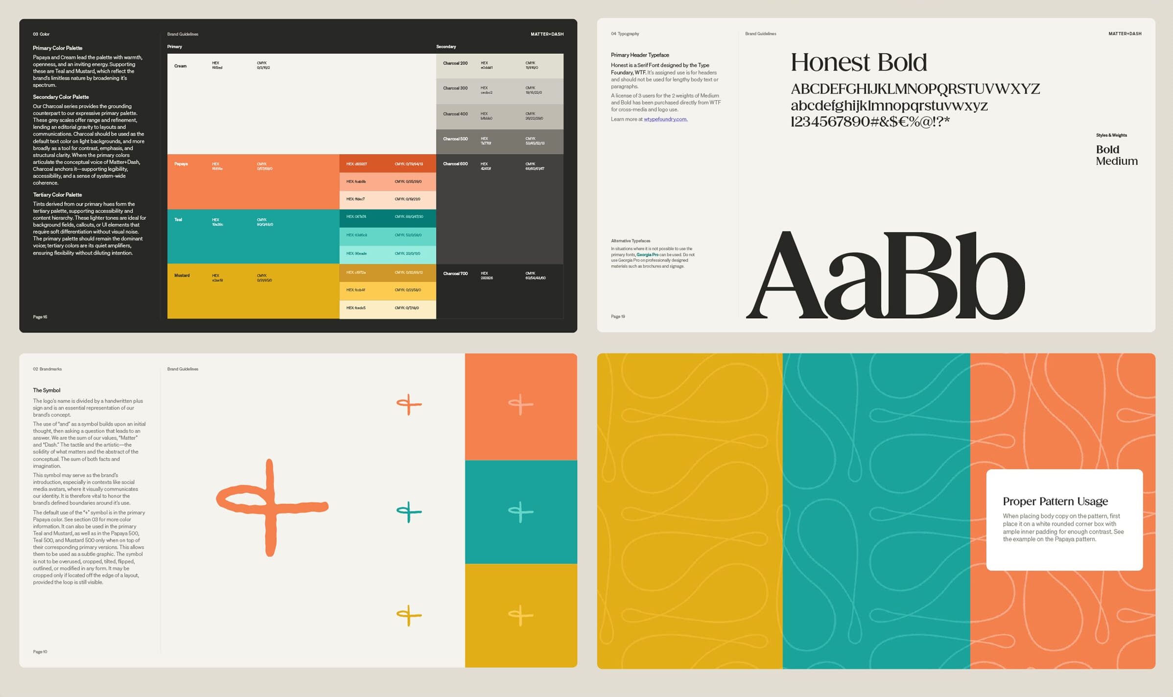
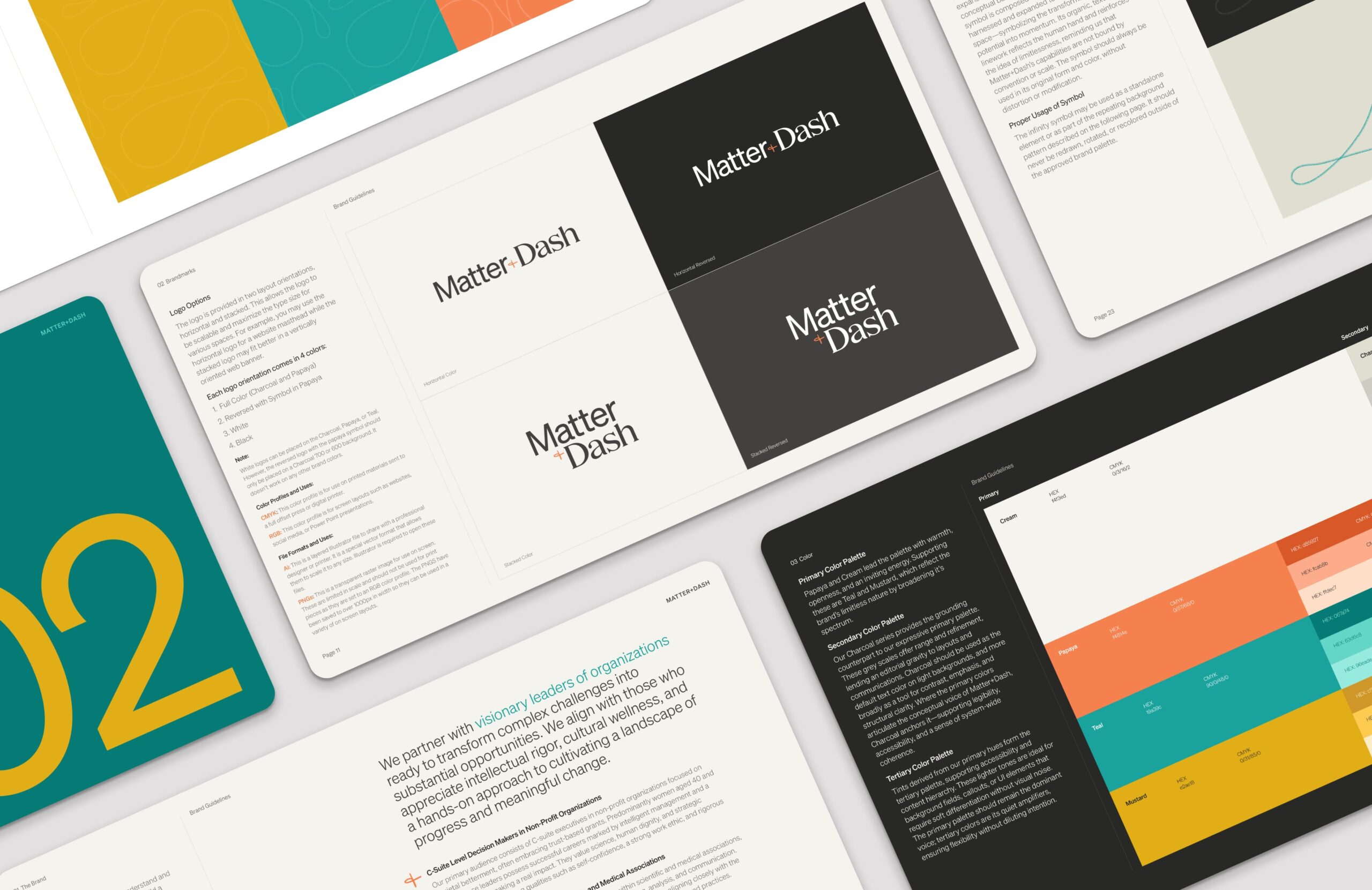
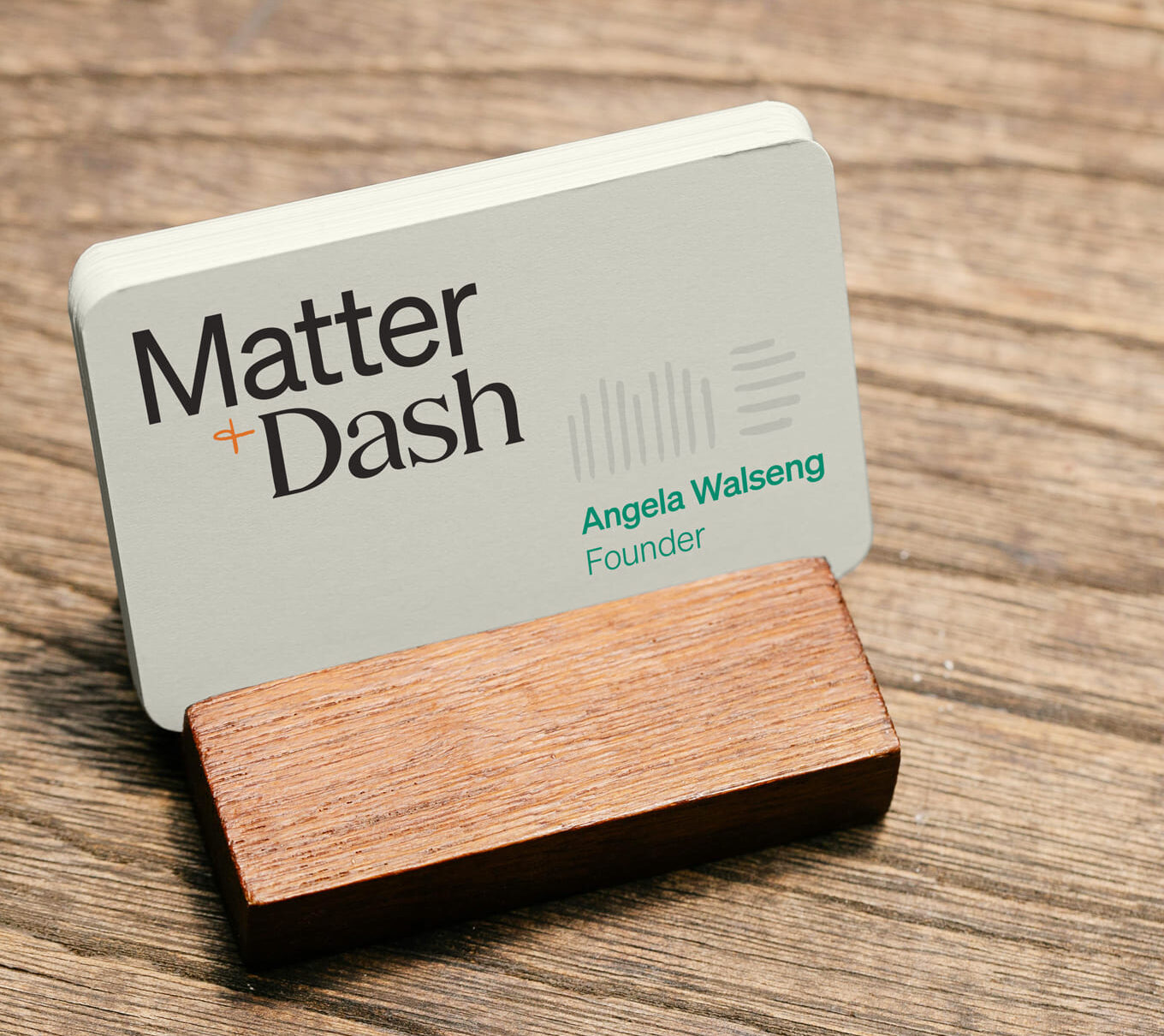
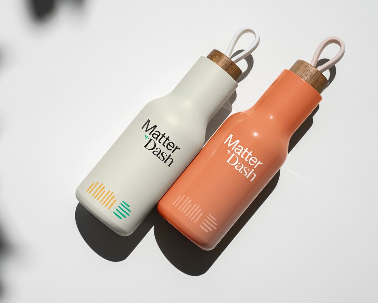
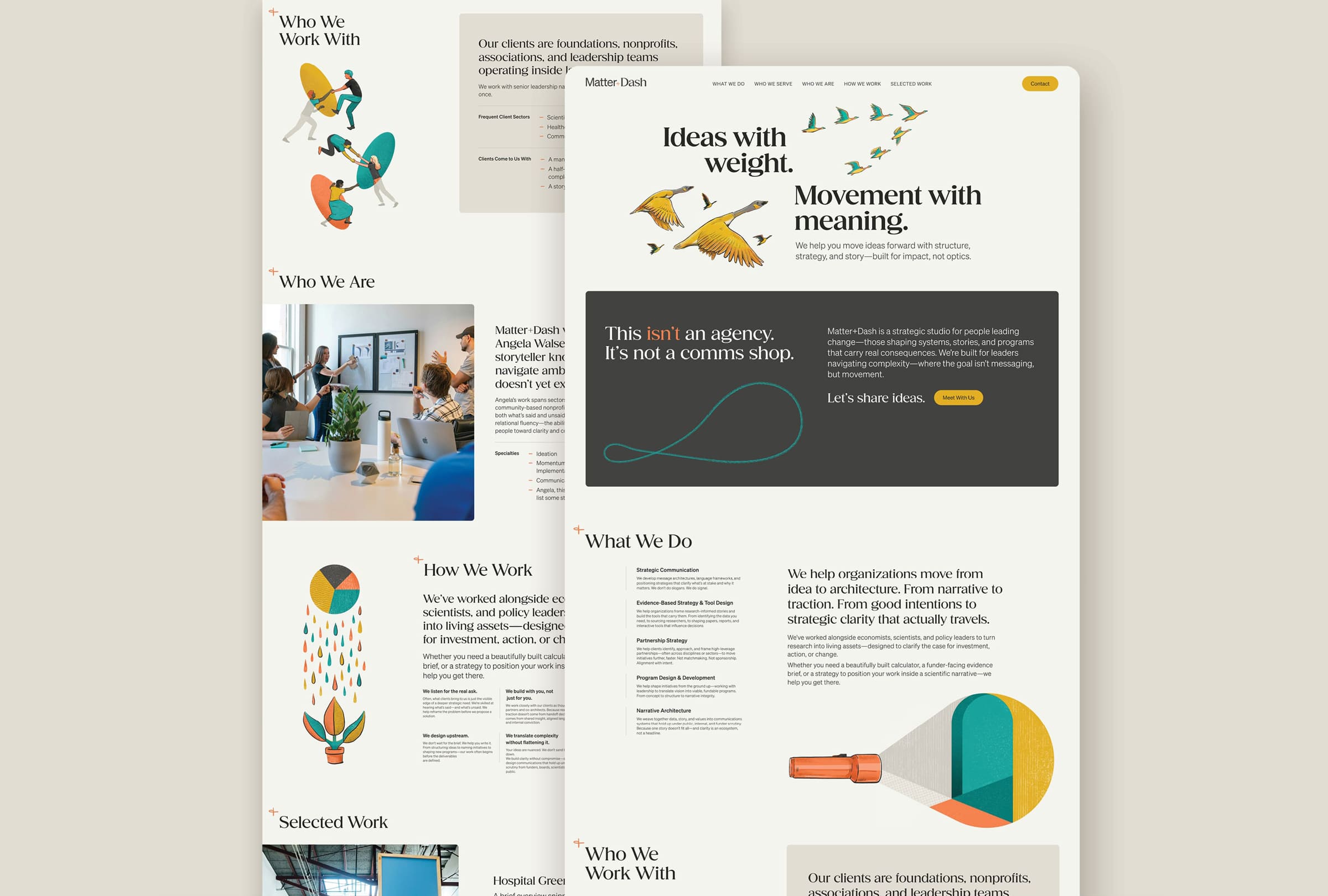
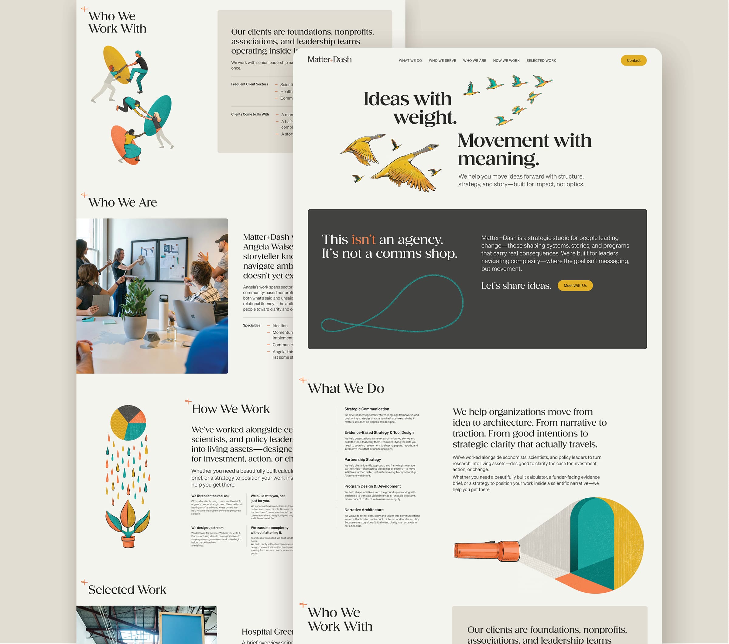
Matter+Dash is a strategic consultancy founded by Angela Walseng, helping organizations move from early ideas to fully realized initiatives. The challenge was communicating services that often begin before a program, message, or framework is fully formed—work that lives in the space between ideation and execution for leaders navigating complex systems. Through brand strategy and a new online presence, we translated Angela’s collaborative process into a clear narrative that reveals how ideas take shape. The identity positions Matter+Dash as both rigorous and human-centered: a hand-drawn plus symbol represents the meeting of data and dialogue, while a refined serif paired with a streamlined sans-serif type system reflect the balance of analytical precision and creative partnership. Custom illustrations further visualize how strategy becomes structure. The initial stage took the form of a focused one-page website—designed to quickly establish the brand and communicate Angela’s approach while the full site architecture continues to evolve. The result is a brand and digital foundation that helps mission-driven leaders immediately recognize their own challenges in the story—and see how their ideas can move forward with clarity, alignment, and action.
ClientMatter+DashServicesBranding, Web UX/UI, IllustrationYear2025LinkCurrently in DevelopmentAgencyDirect ClientRoleDesigner and Illustrator
Turning concepts into clear outcome.
Matter+Dash is a strategic consultancy founded by Angela Walseng, helping organizations move from early ideas to fully realized initiatives. The challenge was communicating services that often begin before a program, message, or framework is fully formed—work that lives in the space between ideation and execution for leaders navigating complex systems. Through brand strategy and a new online presence, we translated Angela’s collaborative process into a clear narrative that reveals how ideas take shape. The identity positions Matter+Dash as both rigorous and human-centered: a hand-drawn plus symbol represents the meeting of data and dialogue, while a refined serif paired with a streamlined sans-serif type system reflect the balance of analytical precision and creative partnership. Custom illustrations further visualize how strategy becomes structure. The initial stage took the form of a focused one-page website—designed to quickly establish the brand and communicate Angela’s approach while the full site architecture continues to evolve. The result is a brand and digital foundation that helps mission-driven leaders immediately recognize their own challenges in the story—and see how their ideas can move forward with clarity, alignment, and action.
ClientMatter+DashServicesBranding, Web UX/UI, IllustrationYear2025LinkCurrently in DevelopmentAgencyDirect ClientRoleDesigner and Illustrator